Your Guide to Accessible Website Design

When we talk about accessible website design, we're really talking about building websites that work for everyone. It’s the practice of creating digital spaces that people with disabilities can use just as effectively as anyone else. Think of it as ensuring every person, regardless of their physical or cognitive abilities, can see, understand, navigate, and engage with the content on the web.
The Four Pillars of Web Accessibility at a Glance
Before we get into the nuts and bolts, it's helpful to understand the foundational principles that guide all accessible design. These are often called the four pillars of accessibility, and they provide a high-level framework for everything we do.
| Pillar | Core Goal |
|---|---|
| Perceivable | Information and interface components must be presentable to users in ways they can perceive. |
| Operable | Users must be able to operate the interface and navigation. |
| Understandable | Information and the operation of the user interface must be understandable. |
| Robust | Content must be robust enough that it can be interpreted reliably by a wide variety of user agents, including assistive technologies. |
These pillars ensure that we're considering the full spectrum of user needs, from the initial perception of content to its interaction with assistive tools. We'll explore these in more detail later.
What Does This Mean in the Real World?

Let's use an analogy. Imagine a public library. If it only had stairs, people who use wheelchairs couldn't get in. If all the books were printed in a tiny font, those with low vision would be left out. The digital world is no different. An accessible website is like a modern library built with ramps, automatic doors, large-print books, and audio versions—it's designed from the start to welcome everyone inside.
This isn’t just a minor issue affecting a small group. We're talking about over one billion people worldwide who live with some form of disability. For them, an inaccessible website isn't a simple inconvenience; it’s a locked door, blocking access to information, essential services, and community connection.
It's a Mindset, Not Just a Checklist
Truly great accessible design is about more than just ticking off technical boxes. It's a fundamental shift in how we approach our work. It means seeing accessibility not as an afterthought or a compliance burden, but as a core part of the entire design and development process.
"Accessibility is not a feature, it's a practice. It's an ongoing commitment to inclusion that benefits every single user, not just those with disabilities."
When you start thinking this way, something amazing happens. Designing for accessibility almost always improves the experience for all your users. For instance, captions on videos are essential for people who are deaf, but they also help someone watching on a noisy train or a non-native speaker trying to follow along. High-contrast text is crucial for users with visual impairments, but it also makes your site easier for anyone to read on a phone in bright sunlight.
Good for People, Great for Business
Businesses are finally catching on. Accessibility is no longer seen as just a legal requirement; it's a massive competitive advantage. Market trends back this up. A recent report found that 72% of organizations now have a digital accessibility policy, and a huge 85% see accessibility as beneficial to their business.
Embracing this practice opens your brand to a much wider audience, builds incredible loyalty, and flat-out improves your site's overall quality. You can dive deeper into the practical steps by reading our guide on how to make a website accessible.
At the end of the day, accessible website design is a powerful blend of empathy and smart business. It’s about building a web that works for all people and ensuring the digital future we're creating is an inclusive one. It’s a non-negotiable part of any modern, successful online strategy.
Decoding the Four WCAG Principles
To build a website that truly works for everyone, you need a solid framework. Thankfully, we have one: the Web Content Accessibility Guidelines (WCAG). This is the gold standard for digital accessibility across the globe.
While the full WCAG document can look a bit intimidating at first, it all boils down to four core principles: Perceivable, Operable, Understandable, and Robust.
These principles, easily remembered with the acronym POUR, give us a practical way to approach accessible design. Think of them less as a strict rulebook and more as four essential questions you need to answer "yes" to for every single person visiting your site. Can they perceive your content? Can they operate your site? Can they understand it? And is it robust enough to work with whatever technology they're using?
Let's break down what each of these pillars really means in practice.
Principle 1: Perceivable
The first principle, Perceivable, is all about making sure users can actually take in the information you're presenting, no matter what their sensory abilities are. This means that no piece of your content can be invisible to any of their senses.
It's a simple concept. If a user is blind, they can't see your beautiful images. If they're deaf, they can't hear the audio on your latest video. The Perceivable principle is our reminder to provide alternatives so that information isn't lost.
This is where some of the most common accessibility features come into play:
- Alternative Text (Alt Text) for Images: This is a short, text-based description of an image that screen readers announce aloud. It's how someone with a visual impairment "sees" what the image is about, effectively turning a visual element into an auditory one.
- Captions and Transcripts for Media: For anyone who is deaf or hard of hearing, captions provide a real-time text version of dialogue in videos. Transcripts go a step further, offering a complete text document of all audio content, including important sound effects and cues.
- Sufficient Color Contrast: This is a big one. Text has to stand out clearly from its background. For users with low vision or color blindness, poor contrast can make your content completely unreadable. It's also one of the most frequent accessibility mistakes we see.
At its heart, this principle is about making sure information can be seamlessly translated—from visual to auditory, or from audio to text—so that nobody is left out of the conversation.
Principle 2: Operable
Next up is Operable. This principle demands that users can successfully navigate and interact with every single part of your website. If someone can't click a button, use a menu, or fill out a form, your website is essentially broken for them.
The bedrock of operability is keyboard accessibility. Many people with motor disabilities don't use a mouse; they rely entirely on a keyboard or devices that mimic keyboard commands. Every interactive element—from links and buttons to dropdowns and sliders—must be reachable and usable with just the Tab, Enter, and arrow keys.
A fantastic way to check for operability is to unplug your mouse and try navigating your entire website. Can you get everywhere and do everything? If you get stuck, you've just found an accessibility barrier you need to fix.
Other key aspects of making a site operable include:
- No Keyboard Traps: A user should never be able to tab into an element, like a pop-up window, and then be unable to tab their way out.
- Sufficient Time: People need enough time to read and act. This means avoiding things like aggressive session timeouts or carousels that move too quickly without a pause button.
- Clear Navigation: A user should always know where they are on your site and be able to easily find what they're looking for.
This infographic shows how building an operable and accessible site isn't just a compliance task—it directly benefits your organization by expanding your audience and making the site better for everyone.
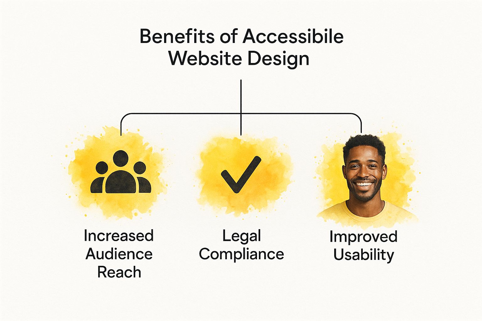
As the visual highlights, creating an accessible experience leads to real business advantages, like reaching more people and improving overall usability across the board.
Principle 3: Understandable
The third principle, Understandable, means the information and the interface have to make sense. It’s not enough for users to simply perceive and operate your site; they have to comprehend it without getting frustrated or confused.
This starts with making your content readable and your site's behavior predictable. Write in clear, simple language. Avoid industry jargon or overly complex sentences unless they're absolutely essential for your audience.
Beyond the text, your website itself needs to operate in a consistent and predictable way. Navigation should be in the same spot on every page. Buttons that look like buttons should act like buttons. When a user does something, the result should feel logical and expected.
This principle really shines when things go wrong.
- Helpful Error Messages: If someone messes up a form field, a vague "Invalid input" message is useless. A good error message is specific: "Please enter your phone number using 10 digits, like 555-123-4567."
- Input Assistance: You can help people avoid mistakes in the first place by providing clear instructions, placeholder text, and helpful tips where they might be needed.
Principle 4: Robust
Finally, the Robust principle is about making sure your content can be interpreted reliably by all sorts of devices and technologies, both today and in the future. Put simply, it means building your website with clean, standard-compliant code.
This might be the most technical of the four principles, but its goal is straightforward: create a site that lasts and plays well with others. As new browsers, screen readers, and assistive tools are developed, a website built on a solid foundation of valid HTML will keep working as intended.
A perfect example is using proper semantic HTML. Instead of building everything with generic <div> tags, use <nav> for navigation, <main> for the main content, and <button> for actual buttons. These tags have built-in meaning that assistive technology understands immediately, creating a far superior experience. By following web standards, you're future-proofing your accessible website design so it remains functional for years to come.
Common Accessibility Mistakes to Avoid
Getting a handle on the principles of accessible design is a fantastic start. But knowing the theory doesn't automatically prevent mistakes from slipping into a live website. Even with the best intentions, it's easy to accidentally build digital barriers that lock people out. Frankly, one of the best ways to get better at this is to learn what not to do.
These aren't obscure, highly technical glitches we're talking about. They're everyday issues that cause real frustration for people with disabilities. And they are everywhere. An ongoing study, the WebAIM Million report, consistently finds that a staggering percentage of the internet’s top home pages have basic, detectable accessibility errors. It's a great resource to see the latest data on common web accessibility failures.
By recognizing these common tripwires, you can sidestep them in your own projects from day one. Let's dig into some of the most frequent offenders.
Neglecting Keyboard Navigation
This is a big one. A huge number of sites are simply impossible to use without a mouse. But for many people with motor disabilities, a keyboard or a device that acts like one is their primary way of getting around the web.
If someone can't get to your main menu, click a "buy now" button, or fill out your contact form using just their keyboard (think Tab, Shift+Tab, and Enter keys), they're stuck. You've essentially closed the door on them. This problem often pops up with custom JavaScript widgets, modals, and complex navigation menus that weren't built with keyboard users in mind. A tell-tale sign is the dreaded "keyboard trap," where you can tab into a pop-up but can't tab back out. The only escape? A full page refresh.
Using Vague and Unhelpful Link Text
Think of links as the doorways of your website. The text of that link is the sign on the door, telling you what's on the other side. Too often, those signs are blank.
Imagine a screen reader rattling off the links on a page: "Click here," "Learn more," "Read more." For a blind user, that's completely useless. It gives them zero context about where they'll end up. They have to guess, which is a frustrating and inefficient way to browse.
Good vs. Bad Link Text
- Bad: To download our guide, click here.
- Good: You can download our complete branding guide to get started.
Writing descriptive link text makes navigation clearer for everyone, but for someone relying on assistive technology, it's the difference between a usable site and an unusable one.
Forgetting About Forms
Forms are where business gets done. It's how customers buy from you, subscribers sign up, and potential clients get in touch. An inaccessible form is more than just an inconvenience; it's a direct roadblock to engagement and conversion.
The most common mistakes with forms are surprisingly basic:
- Missing Labels: Placeholder text is not a label. It disappears as soon as you start typing and screen readers often ignore it entirely. Every single input field needs a properly associated
<label>to tell users what information to enter. - Unclear Error Messages: When a form submission fails, a generic "Invalid Input" message is next to useless. A good error message is specific ("Please enter a valid email address") and is programmatically tied to the field so a screen reader can announce exactly what needs fixing.
- No Keyboard Access: Just like the rest of your site, every part of a form—from text fields to checkboxes and the final submit button—must be reachable and usable with just a keyboard.
These errors might seem small, but they can make it impossible for someone to complete a transaction. Taking the time to build forms correctly is a fundamental part of making sure every user can interact with you effectively.
To put it all together, let’s look at how these simple oversights create very real problems for people.
Accessibility Mistake and Its Impact
| Common Mistake | Who It Affects | How to Fix It |
|---|---|---|
| No alt text on images | Users with visual impairments | Write a short, descriptive alt attribute for every meaningful image. |
| "Click here" link text | Screen reader users | Use descriptive text that explains where the link goes, like "Read our 2024 annual report." |
| "Keyboard trap" in a modal | Keyboard-only users | Ensure a user can open, interact with, and close all pop-ups using only keyboard commands. |
| Poor color contrast | Users with low vision or color blindness | Use a contrast checker tool to ensure your text and background colors meet WCAG AA standards. |
| Form fields without labels | Screen reader users | Programmatically connect a visible <label> tag to every single form input field. |
Avoiding these common pitfalls doesn't require a complete overhaul of your design process. It just requires a bit more awareness and empathy during development. By consciously checking for these issues, you move from simply knowing about accessibility to actively practicing it.
Actionable Steps for Accessible Design
Knowing the principles is one thing, but rolling up your sleeves and putting them into practice is where the magic happens. This is the part where you, the creator, turn good intentions into an inclusive experience. It's time to move from theory to action.
These aren't just tips for brand-new projects. You can apply many of these right now to your existing site and make an immediate, positive difference. Think of them as the building blocks for a digital space that truly welcomes everyone.
Build a Logical Structure with Semantic HTML
Imagine your website's code is its skeleton. For someone using a screen reader, that skeleton is absolutely crucial—it's how they figure out the layout, the hierarchy, and how all the content fits together. The best way to build a strong, reliable skeleton is by using semantic HTML.
Instead of wrapping everything in generic <div> tags, use HTML elements that actually describe their purpose. Doing this gives your content built-in meaning that assistive technologies can interpret instantly, no extra work required.
A few semantic elements are your best friends here:
- Headings (
<h1>,<h2>, etc.): Use these to create a clear outline of your page. A screen reader user can skip from heading to heading to get a quick sense of the content, so make sure they're nested logically and accurately describe each section. - Lists (
<ul>,<ol>,<li>): When you have a list, use proper list tags. This tells a screen reader exactly how many items are there, which is far easier to understand than a block of text separated by line breaks. - Landmarks (
<header>,<nav>,<main>,<aside>,<footer>): These tags act like signposts, defining the major regions of your page. They let users jump directly to the navigation, main content, or footer in a single step.
"Semantic HTML is the bedrock of web accessibility. It's the simplest, most powerful tool you have for making content understandable to assistive technologies. Getting this right solves a huge number of accessibility problems before they even start."
Design Accessible and Usable Forms
Forms are where the action is. They’re your gateway for sales, sign-ups, and customer questions. If your form is inaccessible, it's a dead end. To make sure everyone can get through them, you need to focus on clarity and helpful feedback.
Always start with clear, permanently visible labels. Every single input field needs a <label> tag that is programmatically connected to it. Placeholder text is not an acceptable substitute—it vanishes once someone starts typing and is often completely ignored by screen readers.
Next, give people useful error messages. If a user makes a mistake, don't just flash a generic "Error" message. Pinpoint the exact field and explain what’s wrong (e.g., "Please enter a valid email address"). This specific guidance is what helps people fix problems without getting frustrated and giving up.
Choose Colors with Sufficient Contrast
A beautiful design that no one can read isn't just a shame—it's a failed design. One of the most common and easily fixable accessibility issues is low color contrast. This happens when the text color is too similar to the background, making it a real struggle for people with low vision or certain types of color blindness to read.
WCAG guidelines provide specific targets. For standard text, you need a contrast ratio of at least 4.5:1 to meet the AA standard. The good news is you don't have to guess. There are dozens of free online color contrast checkers that will instantly tell you if your color choices pass muster. Checking this early in the design process will save you a world of headaches later on.
Write Truly Descriptive Link Text
Imagine walking through a building where every single door is just labeled "Enter Here." You'd have no clue where you were going. That's exactly what vague link text like "Click Here" or "Learn More" feels like to someone using a screen reader.
Assistive tech allows users to pull up a list of all the links on a page to navigate quickly. If that list is just "Read More, Read More, Click Here," it's completely useless. The link text itself needs to describe where it goes.
- Don't do this: To see our case studies, click here.
- Do this instead: Read our latest customer case studies.
It's a small change, but it makes a world of difference for navigation and clarity. For small businesses looking for more foundational tips like this, our guide on website design tips for small business offers some great practical advice.
Enhance Interactivity with ARIA When Necessary
Sometimes, plain old HTML doesn't have a ready-made tag for a complex interactive element you've built, like a custom slider, a set of tabs, or a unique dropdown menu. When that happens, ARIA (Accessible Rich Internet Applications) is your go-to solution.
ARIA lets you add extra roles and attributes to your HTML that give assistive technologies more information. For instance, you can use role="tab" to identify the tabs in a widget or aria-expanded="true" to announce that an accordion panel is open.
But here’s a word of caution: use ARIA only when you absolutely have to. The first rule of ARIA is don't use ARIA if a native HTML element can do the job. A sloppy ARIA implementation can cause more problems than it solves, so if you use it, be sure to test it thoroughly.
How to Test Your Website for Accessibility
So, you've put in the work to build an accessible website. That's a huge step. But how do you know if it's really working? You can't just cross your fingers and hope for the best—you need to test. A solid testing plan is the only way to be sure you’re not just ticking boxes, but creating a site that everyone can genuinely use and enjoy.
The best way to approach accessibility testing is with a layered strategy: automated tools, manual checks, and most importantly, real human feedback. Think of it as a three-point inspection. Each layer catches different kinds of problems, and when you combine them, you get a clear picture of how accessible your site truly is.
Start with Automated Testing
Automated testing is your first line of defense. These tools are fantastic for catching the low-hanging fruit. Tools like Google Lighthouse (already in your Chrome browser) or the WAVE Web Accessibility Evaluation Tool can crawl your site in seconds. They'll instantly flag common coding mistakes that violate WCAG guidelines, like missing alt text, low-contrast text, or forms without proper labels.
When you're looking at your site’s overall performance, understanding metrics like Core Web Vitals is also a smart move, as they often overlap with the user experience aspects of accessibility. These tools are incredibly fast and give you a great baseline for your site’s technical health.
Here’s a look at the WAVE tool in action on a webpage.
See how it overlays icons on the page? These instantly point out potential errors, contrast problems, and structural alerts that need a closer look. It’s like getting a quick, visual report card.
But automated tools can only take you so far. They can tell you an image has alt text, but they have no idea if that alt text is actually useful. That's where you, the human, come in.
Perform Manual Checks
Next up is manual testing. This is where you put yourself in your users' shoes and try to get around your site using the same tools they do. This hands-on approach is where you'll find the usability problems that automated scans always miss.
Here are a few essential manual tests you should run:
- Keyboard-Only Navigation: This one's simple but powerful. Unplug your mouse. Now, try to use your entire website with just the Tab, Shift+Tab, Enter, and arrow keys. Can you get to every link, button, and form field? Can you open and close all the menus? If you get trapped anywhere, you’ve just found a critical barrier.
- Screen Reader Testing: Fire up a screen reader and listen to your website. You can use NVDA (it's free for Windows), VoiceOver (built into all Apple devices), or JAWS. Close your eyes and listen. Does the content make sense? Is it read in a logical order?
- Visual Inspection: Zoom your browser in to 200%. Does the layout completely shatter, or does text overlap and become impossible to read? Double-check your color contrast and make sure any information conveyed with color is also available another way.
Involve Users with Disabilities
The final, and frankly most important, layer is user testing. This means inviting people with various disabilities to use your website and tell you about their experience. Their real-world perspective is something you simply can't replicate.
Nothing is more powerful than watching someone try to use your product. User testing reveals the "why" behind the data, uncovering points of frustration and moments of delight that no tool or manual check ever could.
This step is what takes you from technical compliance to true usability. You might find out that your form, while technically accessible, has confusing instructions that trip people up. Or maybe your navigation works with a keyboard, but it's so clunky and inefficient that it's a pain to use. This direct feedback is the ultimate gut-check for your accessible website design, making sure the space you built isn't just accessible, but truly inclusive.
Of course. Here is the rewritten section, designed to sound natural and human-written.
The Business and Legal Case for Accessibility
Let's be honest: making your website accessible is the right thing to do. But it's also one of the smartest business decisions you can make. This isn't just about ethics—it's about protecting your business from serious legal trouble and tapping into a market you might be completely ignoring.
Too many business owners think accessibility laws are fuzzy or that they only apply to big corporations. That's a dangerous assumption. The legal ground is firming up every day, and a website that isn't accessible is becoming a major liability.
Mitigating Significant Legal Risks
In the United States, courts have consistently ruled that the Americans with Disabilities Act (ADA) applies to websites, treating them as "places of public accommodation." What does that mean for you? It means that if your website isn't usable by people with disabilities, you could be facing a discrimination lawsuit.
And this isn't some far-off, theoretical risk. The numbers tell a stark story. In just one recent year, over 3,200 lawsuits were filed in federal courts over inaccessible websites, and that number keeps rising. You can dig into more stats and see the increasing legal focus on digital compliance for yourself. These lawsuits aren't cheap—they can lead to massive settlements, court-ordered redesigns, and a black eye for your brand's reputation.
An inaccessible website isn't just a missed opportunity; it's a potential liability. Proactively embracing accessible design is the most effective way to protect your business from legal challenges and demonstrate a genuine commitment to all your customers.
Unlocking New Market Opportunities
Now, let's step away from the legal scare tactics and look at the massive upside. Roughly one in four adults in the U.S. has a disability. That's a huge group of potential customers with real spending power. If they can't use your website, you're essentially putting up a "Closed" sign for them.
When you build an accessible site, you’re not just avoiding lawsuits; you’re rolling out the welcome mat. This does more than just widen your audience—it builds incredible brand loyalty. People remember the businesses that make them feel seen and included. This kind of commitment is a powerful part of your identity, and you can learn more about how it aligns with essential small business branding tips to strengthen your overall strategy.
Boosting SEO and User Experience for Everyone
Here’s the best part: the work you do for accessibility has a ripple effect that benefits everyone who visits your site, including search engines like Google.
Think about it. The best practices for accessibility are also best practices for great SEO.
- Semantic HTML: When you use proper headings and tags so a screen reader can understand your content, you're also giving Google a perfectly clear roadmap of your site. That’s an SEO win.
- Alt Text for Images: Writing descriptions for images helps users with visual impairments, but it also tells search engines exactly what your images are about. Another SEO win.
- Transcripts for Videos: Providing text versions of your audio or video content makes it accessible and creates a goldmine of keyword-rich content for search crawlers to index.
At the end of the day, an accessible website is just a well-built website. The clear structure, intuitive navigation, and overall usability you create for accessibility make the experience better for every single visitor. That’s how you build a stronger brand and drive real, sustainable growth.
Frequently Asked Questions
As you dive into accessible design, a few common questions always seem to pop up. Here are some straightforward answers to help clear things up and guide your efforts.
What’s the Difference Between Accessibility and Usability?
Think of it like building a house. Accessibility is about making sure everyone can get in the front door, whether they use a wheelchair, have a visual impairment, or have any other disability. It’s about fundamental access.
Usability, on the other hand, is about how enjoyable and efficient the house is once you're inside. Is the layout intuitive? Can you find the kitchen easily? A great website needs both; it must be open to everyone and a pleasure to navigate once they arrive.
Will Making My Site Accessible Ruin Its Design?
Absolutely not. This is probably the biggest myth we hear, and it’s time to put it to rest. Accessibility isn't about sacrificing beautiful design; it’s about smart, functional design.
In fact, the principles of accessibility—like clear contrast, logical structure, and readable fonts—often lead to cleaner, more professional-looking sites that everyone finds easier to use. The best designers know that constraints don't kill creativity; they fuel it.
"The best designs are born from constraints. Accessibility doesn't limit creativity; it challenges designers to create solutions that are both elegant and inclusive, ultimately resulting in a better product."
Is It Expensive to Make an Existing Website Accessible?
The honest answer? It depends. The cost really hinges on how complex your site is and how it was built.
Fixing accessibility issues on an old, tangled website can be a significant project. This is why building accessibility in from the very beginning is always the cheapest, smartest route. But remember, the cost of not being accessible—in lost customers and potential legal trouble—is almost always higher.
Can’t I Just Use an Accessibility Overlay or Plugin?
This is a tempting shortcut, but it's a "band-aid on a broken bone" solution. While some automated tools and plugins can catch low-hanging fruit, they rarely fix the deep, structural issues that truly block users.
Many accessibility experts warn that these overlays often fail to provide real access and can sometimes introduce new problems. Genuine accessible website design is baked into your site’s core foundation, not just sprinkled on top. It requires a thoughtful, human-centered approach that automated tools simply can't replicate.
Ready to build a beautiful, accessible page without writing a single line of code? Linkero provides the tools you need to create a professional web presence that welcomes everyone. Start building your page today.


