Build a One Page Website That Actually Converts Visitors

Why Smart Businesses Are Going One-Page Only
I've helped dozens of businesses simplify their websites, and here’s the thing: complicated sites often do more harm than good. Too many pages, confusing navigation – it all adds up to a frustrating experience that sends visitors clicking away. One-page websites, especially when built with tools like Linkero, offer a refreshing alternative. They present your key info in a single, streamlined flow, making it easy for visitors to find what they need and take action. This focused approach can seriously boost user experience and your conversion rates.
Let's take a look at some data. The infographic below compares one-page and multi-page website performance, looking at average page load time, bounce rate, and conversion rate.
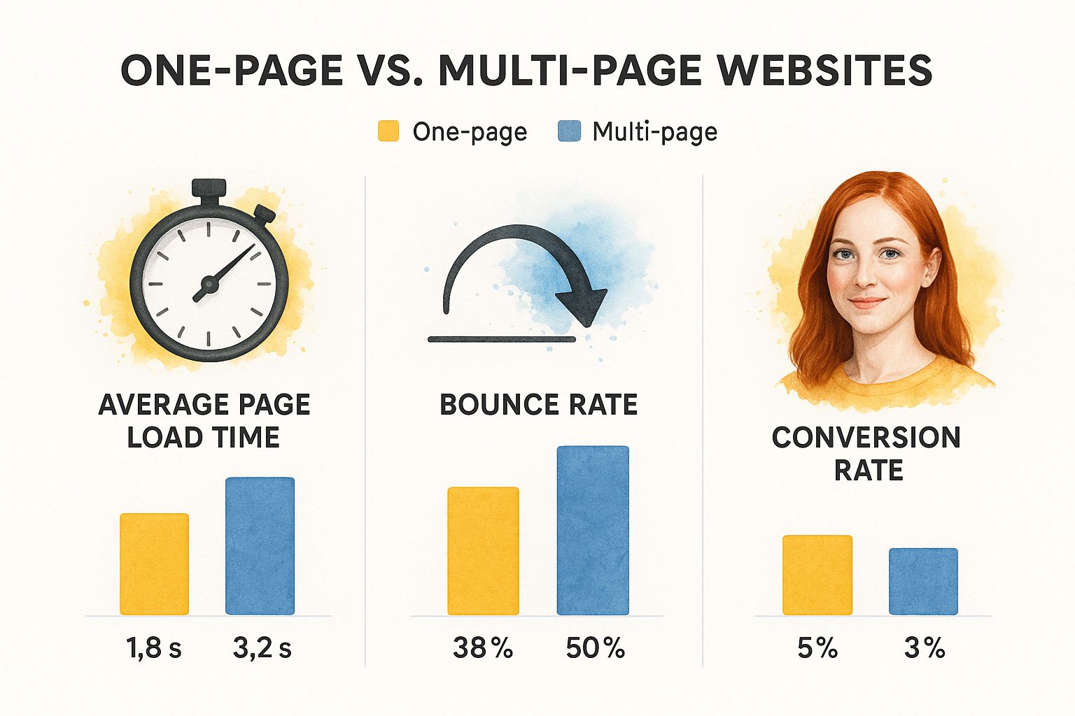
One-page sites often load much faster (1.8 seconds vs. 3.2 seconds), leading to a lower bounce rate (38% vs. 50%) and higher conversions (5% vs. 3%). This streamlined design keeps visitors engaged and encourages them to explore what you offer. It's no wonder building a one-page website is so popular, especially for small businesses. As of 2025, about 71% of small businesses have a website, and many are choosing the simplicity of a one-page design. Discover more insights on small business website trends. Many use DIY website builders, focusing on ease of use and clear communication. This tells us something: simplicity is key to online success.
One-Page vs. Multi-Page: A Closer Look
To help you decide if a one-page website is right for you, let's compare the two approaches:
To help you decide if a one-page website is right for your business, let’s dive into a comparison of the key features, benefits, and drawbacks:
One-Page vs Multi-Page Website Comparison:
| Feature | One-Page Website | Multi-Page Website | Best For |
|---|---|---|---|
| Navigation | Simple, linear | Hierarchical, complex | One-Page: Clear call to action, concise information; Multi-Page: Extensive content, diverse products/services |
| SEO | Can be challenging | More opportunities for optimization | One-Page: Niche businesses, single product focus; Multi-Page: E-commerce, blogs, large organizations |
| User Experience | Streamlined, focused | Detailed, segmented | One-Page: Quick information access, mobile users; Multi-Page: In-depth exploration, complex user journeys |
| Development Cost | Generally lower | Higher, due to complexity | One-Page: Startups, small businesses; Multi-Page: Established brands, complex offerings |
| Content Organization | Concise, impactful | Extensive, categorized | One-Page: Portfolios, landing pages, event promotion; Multi-Page: Corporate websites, online stores, resource libraries |
This table highlights the key differences, making it easier to choose the best approach for your specific needs. One-page sites shine when you need a clear, focused message and a streamlined user journey. Multi-page sites are better for larger, more complex businesses with lots of content and offerings.
A well-designed one-page website is more than just a passing trend. It’s a strategic move for businesses that want to make a strong, lasting impression. Whether you're a service provider, launching a new product, or building your personal brand, a one-page site can be incredibly powerful. It helps you connect with your audience and reach your business goals in a clear and effective way.
Mapping Your Site Strategy Like a Conversion Expert

Before we get our hands dirty with the actual design, let's chat about strategy. Honestly, I've seen so many gorgeous websites completely tank because they missed this essential step. Building a one-page website is a bit like planning a road trip. You wouldn't just start driving without a destination or directions, right? Your website strategy is your roadmap to success.
Defining Your Core Message
The first thing you need to do is pinpoint your core message. What's the single most important thing you want visitors to take away? This message should be the driving force behind all your content decisions. For instance, let's say you're a photographer. Your core message might be something like, "Capturing the raw emotion of your special day." Then, every single thing on your site, from the photos you choose to the words you use in your bio, should reflect that idea.
Mapping the Visitor Journey
Next, put yourself in your ideal visitor's shoes. What are they hoping to achieve on your site? What questions are swirling around in their heads? Try to map out their journey as they click through. A typical one-page site might flow something like this:
- Hero Section: This is your first impression, so make it count! A strong headline and eye-catching visual are key.
- About: Keep it brief and sweet. Introduce yourself and what makes you special.
- Services/Portfolio: Show off your amazing work and what you bring to the table.
- Testimonials: Let your happy clients do the talking! Social proof works wonders.
- Call to Action: What do you want visitors to do next? Make it clear and easy.
Prioritizing Content for Impact
Linkero gives you some really cool tools to structure your content effectively. Use accordions to tuck away less crucial details and keep things clean. Cards are perfect for highlighting key features, and carousels let you showcase your work beautifully. The main thing is to prioritize the most important information and ditch the fluff. Every single element on your page should contribute to your core message and guide visitors towards your call to action. This strategic approach is what really separates the pros from the amateurs. Trust me, by mapping your site strategy like a conversion expert, you'll be setting yourself up for success from the get-go.
Choosing Your Platform Without Getting Burned
So, you’re ready to build a one-page website. Awesome! But picking the right platform can feel like navigating a minefield. There are so many options out there, it's easy to get overwhelmed. Trust me, I’ve been there. I've also seen firsthand how choosing the wrong platform can lead to headaches down the road. Let me share some insights to help you avoid those pitfalls.
Finding the Right Fit for Your Needs
Not all platforms are created equal. Each one has its strengths and weaknesses. WordPress, for example, is incredibly flexible and powerful, but it can be a steep learning curve if you're just starting out. Squarespace is known for its beautiful templates and user-friendly interface, but it can sometimes feel a bit limiting if you have a more complex vision.
Linkero offers a nice balance. It's easy to use, yet still packs enough punch to create something truly special. Think pop-ups, embedded forms, and even cool animation controls. It's perfect for single-page sites that need to do more than just… well, exist.
It’s also worth remembering that the web is a living, breathing thing. Did you know there are over 1.1 billion websites out there as of 2024? And roughly 252,000 new websites are launched every single day! Platforms like WordPress power a huge chunk of the internet—over 62.9%. Choosing a platform with a solid track record and a large community is definitely something to consider. Here are some more interesting website stats if you’re curious.
Avoiding Hidden Costs and Scalability Traps
Always think about the future. Some platforms seem cheap at first, then hit you with unexpected costs as your site grows. Or they’ll nickel and dime you for essential features like custom domains or SEO tools. Look for platforms with transparent pricing that include the must-have features, even on the basic plans. Linkero, for instance, gives you SEO customization and analytics on all plans, starting at just $4/month.
Prioritizing Essential Features
Don't get distracted by shiny bells and whistles. For a one-page website, focus on the essentials: a responsive design that looks great on any device, strong SEO capabilities so people can actually find your site, easy customization options, and reliable performance. Do you really need a built-in blog or e-commerce integration? Or is it more important to showcase your core message on a single, impactful page? Choosing the right platform is the foundation for a one-page website that truly converts.
Designing for Mobile Without Losing Your Mind
Let’s be honest, how often do you actually use your laptop to quickly look something up compared to your phone? Probably not that often. This is why having a mobile-friendly website is so important. I can’t tell you how many times I’ve seen a gorgeous desktop design completely fall apart on a phone screen. It's a conversion killer.
And it's not as simple as just shrinking everything down. You actually need to rethink the entire flow of your content and how people will interact with it on a touchscreen. Think about those touch targets, for example. Are your buttons and links large enough for someone to easily tap with their thumb? How do your images scale and how does the text reflow on different screen sizes? These are critical considerations.
This is where mobile-first design comes into play. You start with the smallest screen and work your way up. It really forces you to prioritize what’s absolutely essential and helps you to create a streamlined experience that works beautifully on any device. Tools like the AI Website Images Generator can be incredibly helpful for optimizing your visuals across different screen sizes.
Another key thing to keep in mind is how people actually use their phones. They’re often on the go, distracted, and, let’s face it, they're not very patient. Your site has to load quickly and get straight to the point. And this is where speed optimization becomes crucial. Did you know that mobile traffic now makes up 54.67% of all website traffic? It’s a huge chunk! And yet, the average mobile website takes a whopping 27.3 seconds to load. That's an eternity online! Discover more insights on website statistics.
This really highlights the importance of streamlined content and a laser focus on user experience when building a one-page website. Check out these website design tips for small businesses. By prioritizing mobile, you're setting yourself up for higher engagement, more conversions, and a much more successful online presence.
Writing Content That Actually Moves People to Act
A gorgeous website means nothing if the content is weak. I've seen so many beautiful one-pagers fall flat because they don't resonate with anyone. They’re eye candy, sure, but they don't actually do anything. Let's dive into crafting content that not only looks fantastic, but also motivates visitors to take action. This is where a one-page website can become seriously powerful.
The Psychology of Headlines That Convert
Your headline is often the first and only chance you get to make an impression. It has to grab attention and make people want to stick around. Ditch the generic stuff like "Welcome to My Website." Instead, focus on the value you bring. For example, "Photography Services" is pretty boring. But "Capture the Unforgettable Moments of Your Wedding Day?" That speaks to a specific need and taps into emotion. See how much stronger that is?
It's not about clever wordplay, it's about connecting with your ideal client.
Writing Benefit-Focused Copy That Resonates
Every single word on your one-page site needs to be pulling its weight. Skip the jargon and concentrate on what your visitors get out of choosing you. Don't just list features like "High-resolution photos." Paint a picture of the benefits: "Stunning images that you'll cherish for a lifetime.” This benefit-driven approach is way more effective. People connect with benefits, not tech specs.
Think about what your customers truly value and speak directly to that.
Structuring Your Value Proposition for Maximum Impact
Your value proposition is the heart of your message. It explains what you do, what makes you different, and why anyone should care. On a one-page website, this has to be crystal clear and concise. Think elevator pitch. Linkero's card blocks are great for breaking this down into digestible chunks. If you're looking to dive deeper into boosting conversions, check out our guide on improving website conversion rates. It’s packed with actionable insights.
A strong value proposition is essential for a successful one-pager.
Crafting Calls to Action That Get Clicks
Your call to action (CTA) is the last piece of the puzzle. It tells visitors exactly what you want them to do. Keep your CTA short, sweet, and compelling. Use action verbs like “Book Now,” “Get a Free Quote,” or “Learn More.” Don't be shy about using contrasting colors and visual cues to make it pop. The whole point of your one-page site is to guide visitors toward a specific action.
These tips will help you transform your one-page website from a static online brochure into a dynamic lead-generating machine. It’s about creating content that not only informs, but also inspires.
Getting Found on Google Without the SEO Headaches

So, you've built an awesome one-page website with Linkero. High five! But now you need people to actually find it. Let's talk SEO – the practical, no-jargon kind.
One of the trickiest things with one-page sites is optimizing for lots of different keywords. With a multi-page site, you'd just create separate pages for each keyword. But here, you only have one page to work with.
The key? Smart content structuring.
Think of your one-page site as a series of sections, each zeroing in on a specific part of your business or a relevant keyword. Imagine you're a photographer. You might have sections for "wedding photography," "portrait photography," and "corporate headshots." This helps search engines like Google understand everything you offer.
Another critical piece is your meta description. This is that little blurb that shows up in search results. It’s your elevator pitch – make it catchy and keyword-rich to grab attention.
Did you know that 93% of online experiences start with a search engine? That makes visibility crucial for your one-page wonder. But here's the kicker: only 40% of websites actually make it to the first page of search results. That’s why SEO is so important. Check out these website stats for more context.
Linkero has built-in SEO tools to get you started. You can tweak your page title, meta description, and even add structured data to give search engines a clearer picture of your content. Remember to keep an eye on things like bounce rate and time on page. These metrics are like your website's vital signs. Here's a deeper dive into website performance metrics. Once you've got some momentum, you might want to think about scaling your content creation.
Fine-Tuning Your One-Page SEO
Here’s a handy checklist to help you optimize your one-page site for search engines:
One-Page Website SEO Checklist Essential SEO tasks and optimization strategies specifically for single-page websites
| SEO Element | Importance | Implementation | Impact |
|---|---|---|---|
| Keyword Research | High | Analyze search volume and relevance to your niche | Attract the right audience to your website |
| Content Structuring | High | Create clear sections for each key topic/keyword | Improve site navigation and search engine crawling |
| Meta Description | High | Write compelling, keyword-rich descriptions | Increase click-through rates from search results |
| Page Title | High | Include relevant keywords, keep it concise | Improve search engine ranking |
| Structured Data | Medium | Implement schema markup for relevant content | Enhance search engine understanding |
| Internal Linking (anchors) | High | Link to different sections within your page | Improve user experience and SEO |
| Image Optimization | Medium | Use descriptive alt text, compress images | Improve page load speed and accessibility |
| Mobile Responsiveness | High | Ensure site adapts to different screen sizes | Reach a wider audience |
| Performance Optimization | High | Minimize page load time | Improve user experience and SEO |
| Analytics Tracking | Medium | Monitor key metrics like bounce rate | Identify areas for improvement |
This checklist covers everything from keyword research to performance optimization. By focusing on these elements, you can boost your visibility and attract more visitors. Remember, SEO is an ongoing process, so keep refining and tweaking your site.
Your Action Plan for One-Page Website Success
You’ve made it! You now have all the pieces to build a killer one-page website that actually gets results. Think of this as your personalized action plan, pulling together everything we’ve talked about. Let’s get this show on the road.
Building Your One-Page Website: A Realistic Timeline
I’ve worked with plenty of clients on this, and here’s a practical timeline for building a one-page website using Linkero:
- Planning & Strategy (1-2 days): This is where you nail down your core message, figure out the journey you want visitors to take on your site, and choose the right keywords. It's the foundation, so take your time and do it right.
- Platform Setup & Design (2-3 days): Pick a template in Linkero that speaks to you, then tweak it to match your brand. Build out the sections and make it your own.
- Content Creation & Optimization (3-4 days): Write copy that’s clear, concise, and compelling. Optimize your images, and sprinkle in some SEO magic.
- Testing & Launch (1-2 days): Before you unleash your site on the world, preview it on different devices (phones, tablets, desktops – the whole shebang). Test all your links and forms to make sure everything works smoothly. Then, hit that publish button!
This timeline works if you're setting aside dedicated time each day. Of course, adjust it based on your own schedule and how complex your site is.
Thinking About Your Budget
One of the great things about building a one-page website with Linkero? It's super budget-friendly. The platform itself is only $4/month to start. Your biggest investment will probably be your time and maybe some premium stock photos or graphics if you want to go that route. Pro tip: Free stock photo sites are your best friend!
Keeping Things Fresh: Maintenance and Growth
Once your site is live, the work isn’t over. Regular maintenance is important. Block out some time each month to update your content, check for broken links, and see how your site is performing using analytics. As your business grows, you might find a one-page site doesn't cut it anymore. That’s okay! Linkero makes it easy to add more pages as your business evolves.
Measuring What Matters and Avoiding Common Traps
Forget about vanity metrics like page views. Focus on the stuff that actually moves the needle: leads, conversions, and happy customers. Keep track of your progress, and don't be afraid to change things up. One mistake I see a lot is people trying to cram way too much onto a single page. Keep it clean, focused, and easy to navigate. Remember, less is often more. This is your roadmap to one-page website success. Now go build something amazing!
Ready to dive in and create your stunning one-page website? Get started with Linkero today!


