7 Essential Landing Page Design Tips for 2025

From First Click to Conversion: The Blueprint for a Perfect Landing Page
Your landing page is your most important salesperson. It’s the first handshake, the critical elevator pitch, and the closing argument all combined into one pivotal moment. When a visitor arrives from an ad, a social media post, or a search result, you have mere seconds to convince them to stay, engage, and convert. The difference between a page that captivates and one that causes a visitor to leave often comes down to its design. However, effective design is more than just surface-level aesthetics; it's a strategic blend of psychology, clarity, and user-centric functionality.
This guide moves beyond generic advice to provide a definitive blueprint for success. We will dissect seven powerful and actionable landing page design tips that cover everything from your core message to the final click. Each tip is structured for immediate implementation, helping you transform underperforming pages into high-converting assets. Understanding the mechanics behind a successful page is crucial, as the ultimate goal is always to improve sales conversion rate.
Whether you're a seasoned marketer optimizing a campaign or a small business owner building your first page, these strategies provide the framework you need. We'll explore how to:
- Craft a compelling value proposition
- Implement strategic call-to-action (CTA) design
- Optimize for a mobile-first experience
- Leverage social proof and trust signals
- Minimize distractions to maintain focus
- Write compelling headlines and copy
- Boost page load speed and performance
1. Craft a Compelling Value Proposition
A visitor lands on your page with one primary question: "What's in it for me?" Your value proposition is the immediate, concise answer to that question. It is a clear statement that communicates the unique benefit a customer will get from your product, service, or offer. As the first element a user typically sees, it must capture attention and convey value within seconds, persuading them to stay and explore further.

A strong value proposition acts as the ultimate hook, setting you apart from competitors by framing your entire offer around customer-centric outcomes. Without a clear one, visitors lack context and motivation, leading to high bounce rates and lost conversions. This is one of the most foundational landing page design tips because it directly addresses user intent and provides a compelling reason to engage.
How to Structure Your Message
Focus on benefits, not just features. While your software might have "AI-powered analytics," the user benefit is "Get powerful marketing insights without the guesswork." Frame your message using a problem-solution narrative. First, identify the core pain point your target audience experiences. Then, briefly agitate that problem by hinting at the frustration it causes, and finally, present your offer as the clear, simple solution. A well-crafted value proposition is fundamental for any successful lead capture landing page, as it provides the initial motivation for a visitor to convert.
Actionable Tips for Implementation
- Be Incredibly Clear and Concise: Your headline should be powerful and easily digestible, ideally under 10 words. Uber's "Get there. Your day belongs to you" is a perfect example, focusing on convenience and freedom rather than the app's technical features.
- Focus on the Outcome: Your audience cares most about what they will achieve. Slack’s classic proposition, "Be more productive at work with less effort," is a masterclass in communicating a direct and desirable result.
- Use a Supporting Subheading: Complement your main headline with a one or two-sentence subheading. This can add important context, specify who the product is for, or briefly explain how it delivers on its promise.
- A/B Test Relentlessly: Never assume you have the perfect message. Create two or three distinct variations of your value proposition and use A/B testing tools to gather data on which one generates the most engagement and conversions.
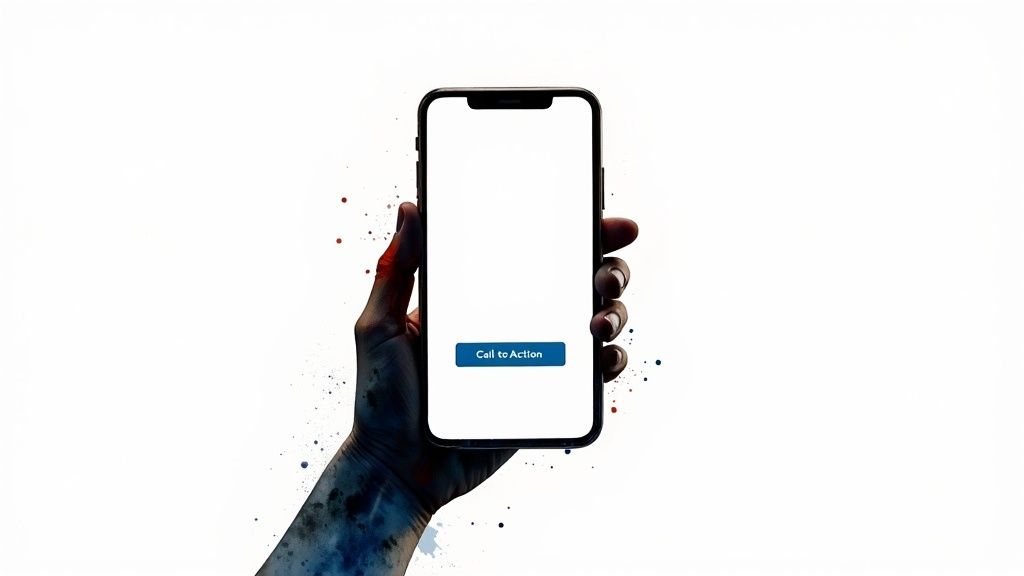
2. Implement Strategic Call-to-Action (CTA) Design
Your Call-to-Action (CTA) is the single most important interactive element on your landing page, serving as the direct gateway to conversion. It’s the button you want users to click, whether it's to sign up, buy now, or learn more. Strategic CTA design goes beyond just a button; it involves a thoughtful combination of placement, color, size, and copy to psychologically guide the user toward taking the desired action and completing the conversion goal.

A weak or poorly placed CTA creates friction and hesitation, effectively becoming a dead end for your user's journey. Even with a brilliant value proposition, if the final step isn’t compelling and obvious, potential leads will drop off. This makes mastering your CTA one of the most crucial landing page design tips because it directly translates your page’s persuasive power into measurable results like sign-ups, sales, or inquiries.
The Anatomy of a High-Converting CTA
A successful CTA is built on a foundation of visual hierarchy and persuasive psychology. It must visually pop from the page using a contrasting color that aligns with your brand yet demands attention. Its copy should be action-oriented, concise, and communicate value. Instead of a generic "Submit," use verbs that promise a benefit, like HubSpot’s "Get Started Free" or Spotify’s "Play Free Now." The goal is to remove all ambiguity and make clicking the button feel like the most logical and rewarding next step for the visitor.
Actionable Tips for Implementation
- Use First-Person Language: Frame the action from the user’s perspective. "Start My Free Trial" often outperforms "Start Your Free Trial" because it creates a sense of ownership. This subtle shift in copy makes the benefit feel more immediate and personal.
- Make it Stand Out with Color and Space: Your CTA button should be a high-contrast color that doesn't get lost in your design. Surround it with ample white space to draw the eye's attention directly to it, preventing other elements from competing for focus.
- Create a Sense of Urgency: Motivate immediate action by incorporating time-sensitive words. Phrases like "Get Access Now," "Claim Your Spot Today," or "Limited Time Offer" trigger a fear of missing out (FOMO) and encourage users to act instead of procrastinating.
- Place CTAs Strategically: On longer landing pages, don't make users scroll back to the top to convert. Place a CTA after each major section or every 3-4 scroll depths. This ensures a conversion opportunity is always visible as the user builds interest down the page.
3. Optimize for Mobile-First Experience
With mobile traffic now dominating global web browsing, a mobile-first approach is no longer an option; it's a necessity. This design philosophy involves creating your landing page for the smallest screen first, then progressively enhancing it for larger devices like tablets and desktops. By prioritizing the mobile experience, you ensure that the core message and functionality are perfectly optimized for the majority of your visitors, impacting everything from load times to thumb-friendly navigation.
This strategy is one of the most critical landing page design tips because it directly aligns with how both users and search engines evaluate your site. Google’s mobile-first indexing means your site's mobile version is the primary one used for ranking, making optimization essential for SEO. A clunky, slow, or hard-to-navigate mobile page will frustrate users, leading to high bounce rates and signaling to Google that your page provides a poor experience, ultimately harming your visibility and conversion potential.
How to Approach Mobile Design
Adopting a mobile-first mindset forces you to focus on simplicity and prioritization. Start by identifying the most critical elements: your value proposition, a clear call-to-action, and essential supporting content. Design these components within the constraints of a single-column layout, which is ideal for vertical scrolling on a phone. This constraint-driven process eliminates clutter and ensures your message is direct and easy to digest, a benefit that often carries over to a cleaner, more effective desktop design.
Actionable Tips for Implementation
- Make Buttons Thumb-Friendly: Design your CTAs to be at least 44x44 pixels to ensure they are easy to tap accurately with a thumb. To further enhance your landing page's conversion rate, consider how the design and placement of call to action buttons guide users on a smaller screen.
- Optimize Images and Media: Mobile users are often on slower networks. Compress images using modern formats like WebP and implement lazy loading so that images below the fold only load as the user scrolls down, drastically improving initial page speed.
- Prioritize Above-the-Fold Content: The limited screen real estate on mobile makes the "above-the-fold" area invaluable. Your core value proposition and primary CTA must be immediately visible without any scrolling to capture attention instantly.
- Test on Actual Devices: Browser emulators are helpful, but they can't replicate the nuances of a real-world user experience. Always test your landing page on a variety of actual iOS and Android devices to check for touch accuracy, performance, and readability in different conditions.
4. Leverage Social Proof and Trust Signals
A visitor arrives on your landing page with a healthy dose of skepticism. Social proof is your most powerful tool to overcome this hesitation, leveraging the psychological principle that people look to others' actions to guide their own decisions. By showcasing evidence that other people trust your brand, you reduce the perceived risk of conversion and build instant credibility.

Trust signals like testimonials, client logos, and security badges transform your claims from marketing-speak into verifiable facts. They show that real people and reputable companies have already put their faith in you and seen positive results. This validation is one of the most essential landing page design tips because it overcomes the final hurdles of doubt that prevent a visitor from clicking "buy" or "sign up."
How to Build Credibility
The key is to use a variety of signals tailored to your offer. For B2B services, a wall of client logos featuring well-known companies, like Salesforce does, can instantly establish authority. For consumer products, integrating a feed of real-time reviews from a platform like Trustpilot provides transparent, up-to-date validation. For complex solutions, detailed customer stories with specific metrics, like those used by Basecamp, can be incredibly persuasive. There are many powerful social proof marketing examples that demonstrate how to authentically build trust and encourage action.
Actionable Tips for Implementation
- Be Specific and Quantifiable: Instead of "great service," use a testimonial that says, "Their team helped us increase leads by 45% in just two months." Numbers add weight and believability.
- Show, Don't Just Tell: Include high-quality photos or short video clips of the customers giving testimonials. Seeing a real person's face creates a much stronger emotional connection than text alone.
- Display Security Badges: Place trust seals like SSL certificates, Norton, or McAfee badges prominently near forms where users enter personal or payment information. This directly addresses security concerns at the point of conversion.
- Keep Your Proof Fresh: If you're displaying reviews or social media mentions, ensure they are recent. Outdated proof from two years ago can make your brand seem stagnant. Rotate testimonials to highlight different benefits.
5. Minimize Distractions and Maintain Focus
A landing page has one job: to convert. Every element on the page should serve that single purpose. When a visitor arrives, their attention is a finite resource. Unnecessary navigation menus, competing calls-to-action, social media links, or excessive design flair act as "leaks" that drain this focus, guiding users away from the conversion goal you worked so hard to bring them to.
The core principle here is maintaining a 1:1 attention ratio, a concept popularized by platforms like Unbounce, which means the number of goals on the page (one) should equal the number of available actions. By systematically removing every potential exit path, you create a focused, persuasive funnel. This minimalist approach isn't about boring design; it's about purposeful design, ensuring the visitor's journey has a clear, singular destination. This is one of the most impactful landing page design tips because it directly controls the user's path.
How to Create a Focused Environment
Creating focus starts with subtraction. The most common culprit is the main website navigation bar, which offers dozens of potential escape routes. On a landing page, this should be removed entirely. Your goal is to build a self-contained experience where the only way forward is through your call-to-action. To increase trust and credibility without adding distracting external links, you should integrate trust signals directly onto the page. You can learn more about the power of ecommerce social proof to see how testimonials, partner logos, and user counts can build confidence without leading visitors astray.
Actionable Tips for Implementation
- Remove or Simplify Navigation: Eliminate your main site navigation completely. If absolutely necessary, replace it with a simplified version that only links to essential, on-page anchor points or a contact modal.
- Use Strategic White Space: Don't crowd your elements. Use generous white space, also known as negative space, to create visual breathing room, which helps key elements like your headline and CTA button stand out.
- Guide the Eye with Directional Cues: Use subtle visual cues like arrows, leading lines, or even the gaze of people in your imagery to direct attention towards your primary call-to-action.
- Limit Your Color Palette: A simple color scheme of two to three complementary colors is less visually overwhelming. Use your brightest, most contrasting color exclusively for your CTA button to make it pop.
6. Create Compelling Headlines and Copy
While your value proposition earns a visitor's initial attention, your headlines and body copy do the heavy lifting of keeping them engaged and persuading them to act. The copy is your silent salesperson. It’s the narrative that guides a user from curiosity to conversion, answering their questions, addressing their doubts, and building a case for your offer. Every word on your page should serve a purpose, working in concert to make the desired action feel like the next logical step.
Effective copy transforms a simple webpage into a powerful conversion tool. It moves beyond just describing features and instead focuses on articulating benefits in a way that resonates with the visitor's emotions and needs. Without compelling copy, even the most visually stunning design will fail to connect with its audience, leading to confusion and abandonment. Mastering your messaging is one of the most critical landing page design tips because it directly influences how a visitor perceives your brand and the value you provide.
How to Write for Conversion
Your copy should speak your audience's language, not your internal company jargon. The most effective approach is to follow the classic AIDA formula: grab their Attention with a powerful headline, build their Interest by highlighting the most relevant benefits, create Desire by painting a picture of their success, and then prompt Action with a clear and urgent call-to-action. Brands like Grammarly excel at this by starting with a problem-focused headline that grabs the attention of anyone who writes, immediately building interest in their solution.
Actionable Tips for Implementation
- Address the Visitor Directly: Use "you" and "your" to make the conversation personal and focused on the user's needs. Dollar Shave Club’s irreverent, direct-to-consumer tone is a prime example of copy that builds a strong, personal connection.
- Keep Sentences Short and Punchy: Online readers scan, they don't read word-for-word. Break up text with short sentences, subheadings, and bullet points to make your key messages easy to digest at a glance.
- Use Numbers and Specificity: Vague promises are forgettable. Instead of "fast service," try "Get your delivery in 24 hours." Zoom effectively communicates value with clear, benefit-focused headlines like "One consistent enterprise experience."
- Test Emotional vs. Rational Appeals: Does your audience respond better to data-driven arguments or to storytelling that evokes an emotional response? A/B test different copy angles to see which one drives more conversions for your specific offer.
7. Optimize Page Load Speed and Performance
In the digital world, speed is not a feature; it is a requirement. A visitor's attention span is incredibly short, and a slow-loading page is one of the fastest ways to lose a potential customer. Even a one-second delay can slash conversions by up to 7%, making speed optimization a critical, non-negotiable element of effective landing page design.
Fast-loading pages directly correlate with a better user experience, lower bounce rates, and higher search engine rankings. Google explicitly uses page speed as a ranking factor, rewarding faster sites with better visibility. The business case is undeniable; Pinterest saw a 15% increase in sign-ups after cutting wait times by 40%, while Amazon famously calculated that every 100ms of latency cost them 1% in sales. This is one of the most powerful landing page design tips because it impacts a user's perception before they even consume your content.
How to Approach Performance Optimization
Focus on the three core pillars of speed: assets, code, and hosting. The most common speed bottlenecks are large, unoptimized images (assets), inefficient JavaScript and CSS files (code), and slow server response times (hosting). The solution involves a multi-pronged technical approach. This includes compressing images without sacrificing quality, minifying code to reduce file sizes, and leveraging a Content Delivery Network (CDN) to serve content from a location closer to the user. Monitoring these elements is crucial, and you can learn more about key website performance metrics to master this process.
Actionable Tips for Implementation
- Aim for Under 3 Seconds: Your page should fully load in under three seconds, especially on mobile devices where connections can be slower. This is the industry-standard benchmark for retaining visitor attention.
- Use Diagnostic Tools: Regularly run your landing page URL through tools like Google PageSpeed Insights. It provides a detailed report and specific, actionable recommendations to improve performance.
- Implement Lazy Loading: Configure images and videos "below the fold" to load only as the user scrolls down to them. This dramatically improves the initial perceived load time.
- Choose Quality Hosting: Your hosting provider matters. A cheap, shared hosting plan can lead to slow server response times. Invest in a reliable host known for speed and uptime.
- Audit Scripts and Plugins: Periodically review all third-party scripts and plugins. Each one adds to your page's load time. Deactivate and delete any that are not absolutely essential for the page's functionality.
Landing Page Design Tips Comparison
| Technique | Implementation Complexity 🔄 | Resource Requirements ⚡ | Expected Outcomes 📊 | Ideal Use Cases 💡 | Key Advantages ⭐ |
|---|---|---|---|---|---|
| Craft a Compelling Value Proposition | Medium - requires deep customer insight and A/B testing | Moderate - research and copywriting | High - clarifies purpose, reduces bounce, raises conversions | Early funnel pages, new product launches | Clear differentiation, immediate visitor understanding |
| Implement Strategic Call-to-Action (CTA) Design | Low - straightforward but needs testing | Low - design and copy tweaks | High - directly influences conversion rates | Anywhere with a conversion goal | Clear direction, easy optimization, drives action |
| Optimize for Mobile-First Experience | High - responsive design and testing on devices | High - design, development, image optimization | High - captures mobile users, better SEO, reduces bounce | Mobile-heavy traffic sites, broad audience | Better UX on mobile, improved rankings, faster load |
| Leverage Social Proof and Trust Signals | Medium - ongoing collection & integration | Moderate - content curation and design | High - builds trust, reduces risk, boosts conversions | New visitor skepticism, high-trust required sales | Credibility, conversion lift, risk reduction |
| Minimize Distractions and Maintain Focus | Low - design discipline and content pruning | Low - minimal design elements | Medium - increases focus, reduces choice paralysis | Pages with high bounce due to clutter | Clearer user journey, faster load, focused messaging |
| Create Compelling Headlines and Copy | Medium - requires audience insight and testing | Moderate - copywriting effort | High - improves engagement, qualification, emotional connection | All landing pages needing strong messaging | Strong first impression, emotional resonance |
| Optimize Page Load Speed and Performance | High - technical optimization needed | High - developer expertise and tools | Very High - better conversions, SEO, lower bounce | Any page with large traffic or ecommerce | Faster experience, better rankings, reduced drop-offs |
Start Building High-Converting Pages Today
You've just explored a comprehensive toolkit of strategies designed to transform your landing pages from simple digital brochures into powerful conversion engines. The journey to mastering high-performance design isn't about finding a single magic bullet. Instead, it's about understanding how these individual elements work together to create a seamless, persuasive, and user-centric experience. Each of the landing page design tips we've covered addresses a critical piece of the puzzle, guiding your visitor from initial curiosity to decisive action.
True success lies in internalizing the core principles behind these tactics. Think of your landing page strategy as being built on three foundational pillars, each essential for supporting your overall conversion goals.
The Core Message: Clarity and Value
The first and most critical pillar is your message. This is where you connect with your audience on a fundamental level.
- Your Value Proposition and Headline: These must work in tandem to immediately answer the visitor's crucial question: "What's in it for me?" A strong headline grabs attention, and the value proposition clearly articulates the unique benefit you offer, setting you apart from the competition.
- Compelling Copy: Every word on your page should reinforce this value. Use clear, benefit-driven language that speaks directly to your audience's pain points and aspirations, making the solution you offer feel both essential and accessible.
The User Experience: Frictionless and Focused
The second pillar is the user's journey. A confusing or slow experience is the fastest way to lose a potential customer. Your goal is to remove every possible obstacle.
- Mobile-First Design and Page Speed: Since a majority of users will likely visit on a mobile device, designing for that experience first is non-negotiable. This, combined with optimizing for lightning-fast load times, ensures you don't lose visitors to impatience. A three-second delay can be devastating to your conversion rates.
- Minimizing Distractions: A great landing page has a single, focused objective. By removing unnecessary navigation links, competing offers, and visual clutter, you create a clear path directly to your call-to-action, keeping the user focused on the one action you want them to take.
The Foundation of Trust: Credibility and Action
Finally, even with a clear message and a perfect user experience, a visitor won't convert without trust. This third pillar is what gives them the confidence to click "buy," "subscribe," or "download."
- Social Proof and Trust Signals: Integrating testimonials, customer logos, case studies, or security badges provides third-party validation. It shows visitors that real people and businesses have found value in your offer, reducing perceived risk.
- Strategic CTA Design: Your call-to-action is the culmination of all your efforts. It needs to be visually prominent, use action-oriented language, and feel like the logical next step in the journey you've created. This is the final handshake that seals the deal.
Mastering these landing page design tips is an ongoing process of implementation, testing, and refinement. The most important step is the one you take right now. Don't aim for abstract perfection; aim for immediate progress.
Ready to put these powerful principles into practice without the technical headache? Linkero is a no-code, block-based builder that empowers you to create stunning, high-converting landing pages in minutes. Its intuitive drag-and-drop interface makes it easy to implement every tip discussed, from embedding social proof to designing custom CTAs, ensuring your page is optimized for success from the moment you hit publish.


